Lab 4

The CSS Porder Property

The border property is a combination of border color, border width, and border style properties. If desired the user can simply specificy each of these components using border-color, border-width, and border-style. The individual border properties (e.g. border-bottom, border-top, etc) can also be set using the same border property

The CSS Padding Property

This is the amount of space between an element's content and its border. In contrast, margin is the space between an element's border and the nearest element.

The CSS Font-family Property

The browser will begin by trying to apply the first font listed but if this is not available, it will go to the next specified font-family until one is found. One should also list a generic font-family in case none of the specific fonts are available.

The CSS Font-size Property

You can speicfy the font-size using various units. Pixels: element will have the exact number of pixels specified in height; em: This is a computed font size whereby 1em represents the font size of the element which is being selected used, the number before em acts as a multiplier of this font size, relative to the font that the browser is currently using; rem: similar to the em units but the base 1rem is relative to the root html element, not the parent element; ex: Similar to the em units except the base 1ex is the x-height of the first available font used on the page, not the current font selected by the reader.
Lab 5

In order to center an image, add the classes d-block and mx-auto to the img tag. By doing so, Bootstrap applies the CSS properties of margin-left and margin-right both with the value of auto!important.
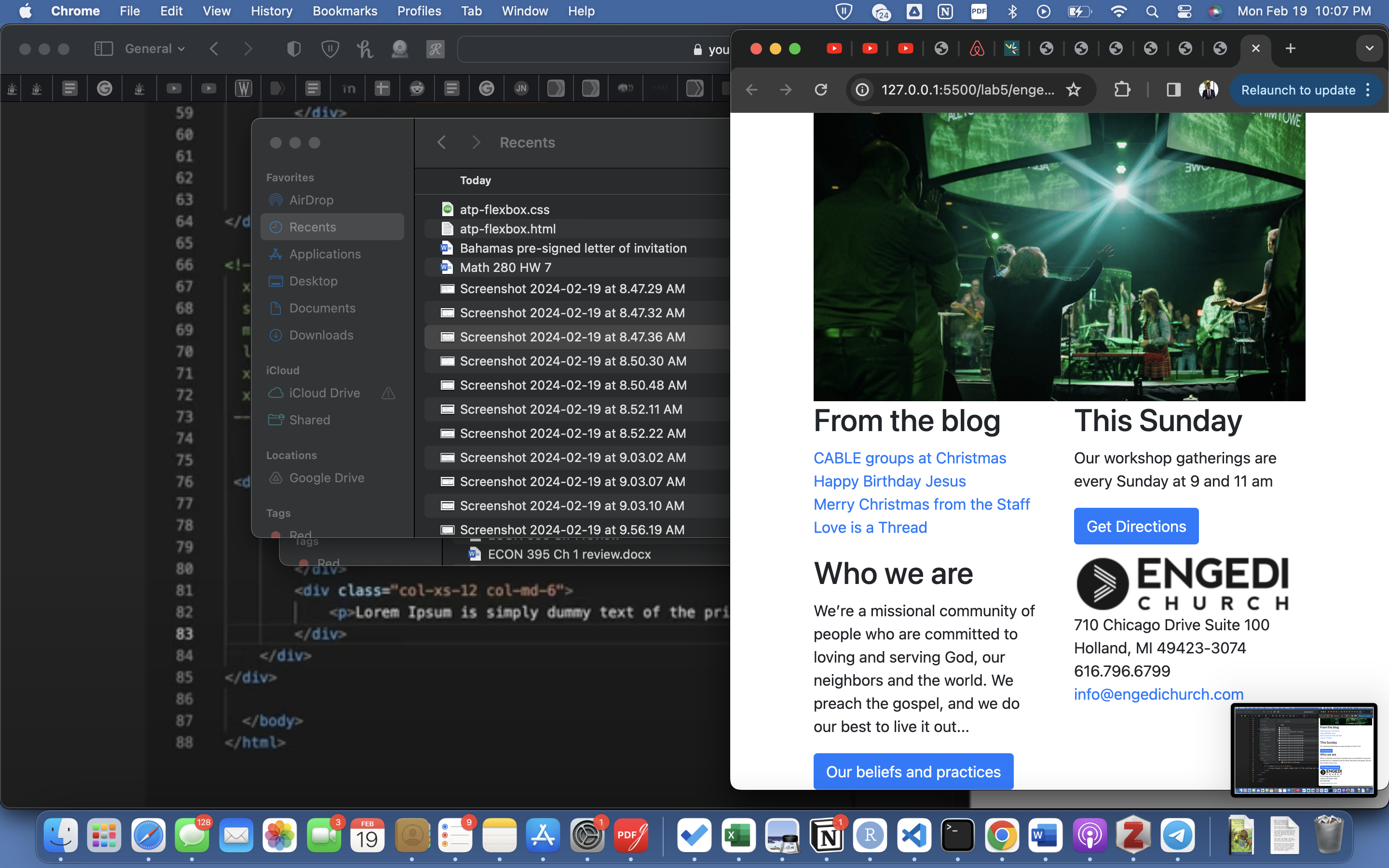
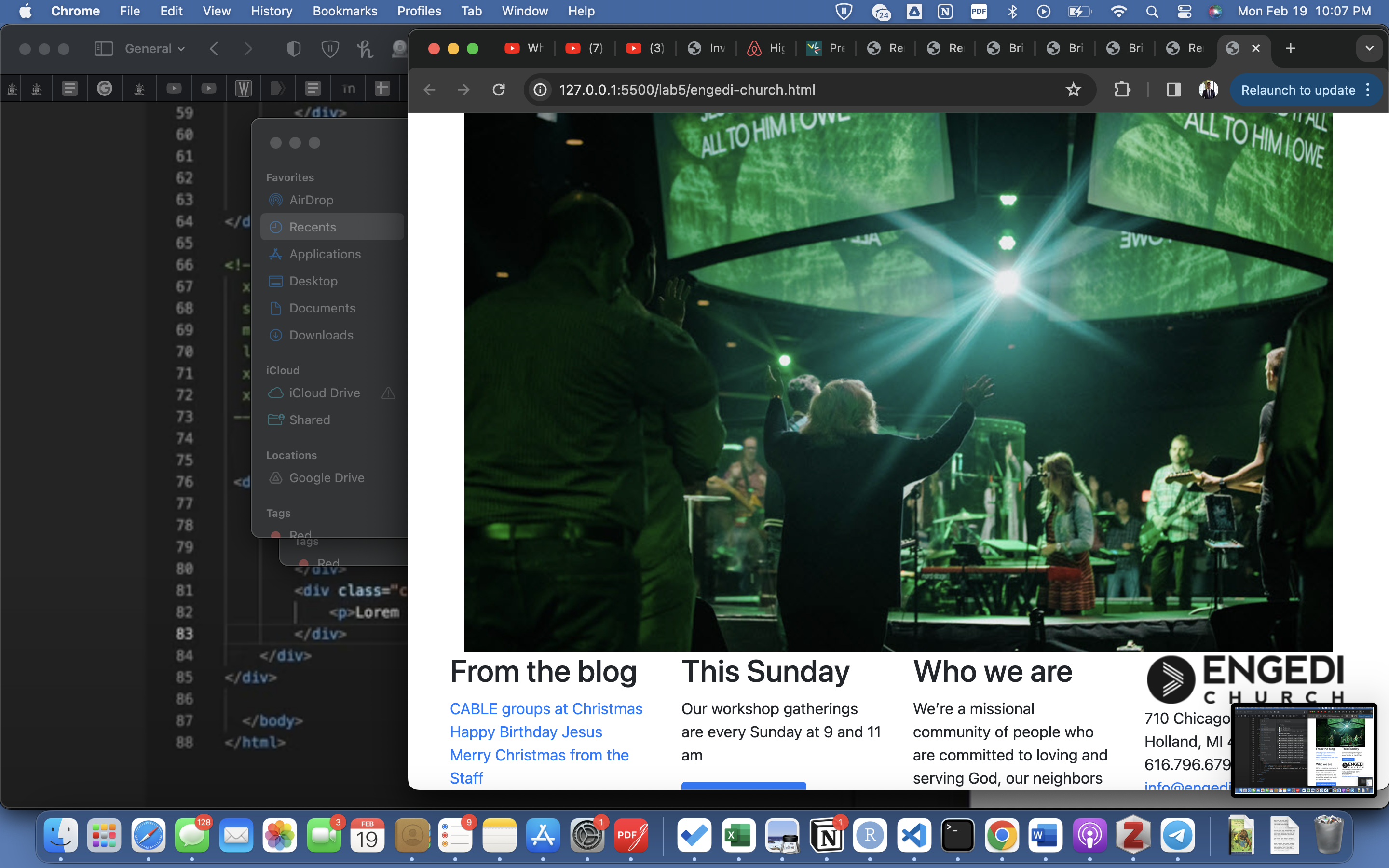
By adding a class of col-12, col-sm-6, col-md-3, and col-lg-3 I was able to specify how the footer div elements should be arranged in the 12 "spaces" available. Below are screenshots of the footer at sizes xs, small, medium and large respectively:
XSSmallAt least medium
We can add a background-image from the web by setting the value to url() with its parameter set to the desired link. Then, using padding and setting background-repeat to no-repeat, we can set the location of the image in relation to our text and limit it to only one instance of the image.
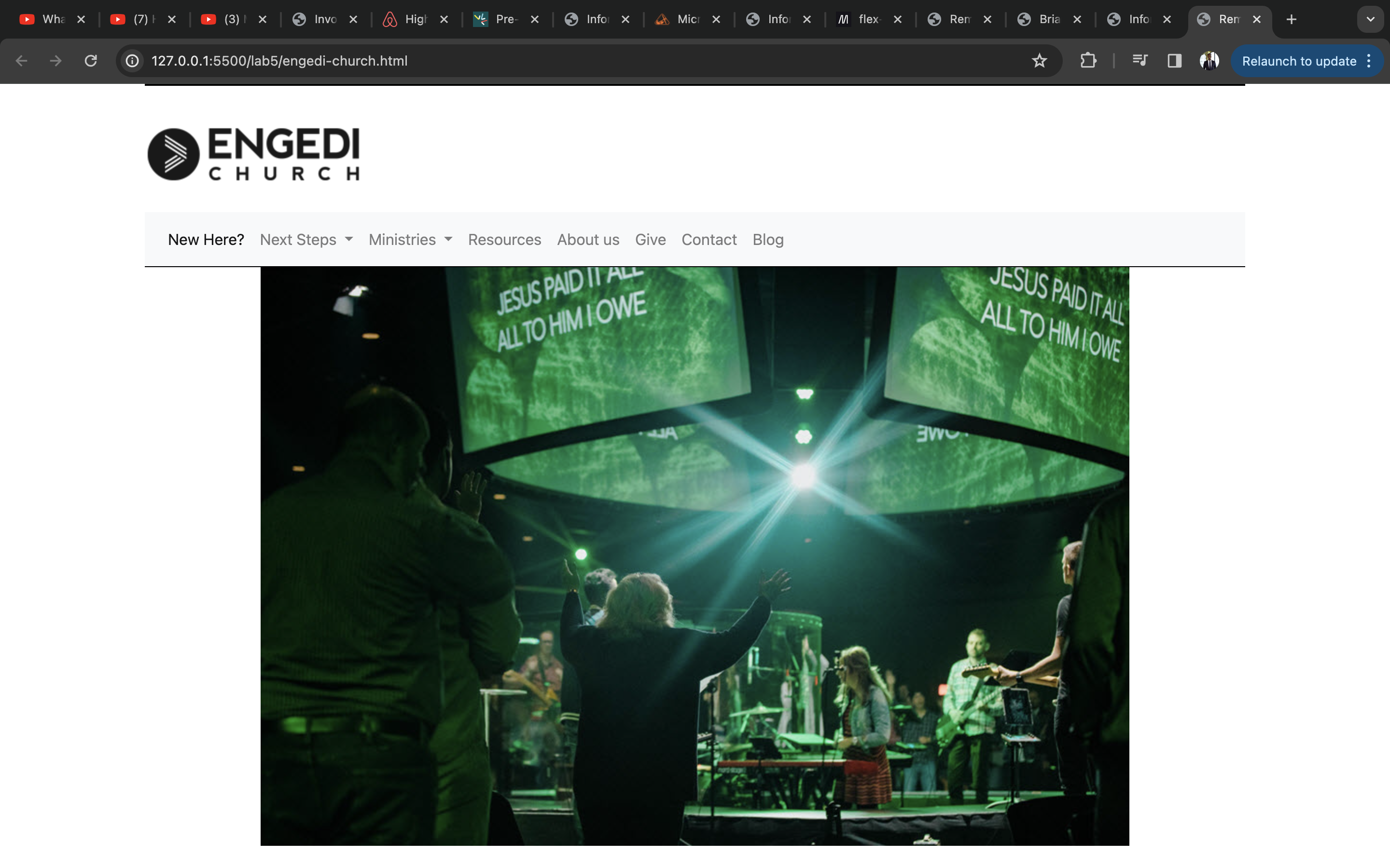
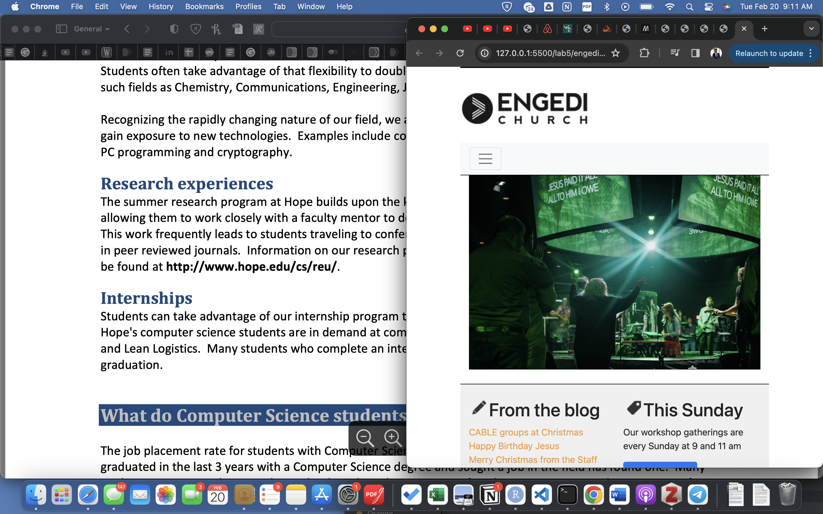
Using the display property set to none and different navbar screen sizes class values (each with a respective media query with different screen sizes), we were able to control the visibility of a button element and the content in the vavigation bar. Both in this exercise and the next, I got to use !important to override properties specificed by Bootstrap.
Without hamburger menuWith hamburger menu
After adding the content in its appropriate format (e.g. p, h2, h3, etc), I put everything either in div classes or sections to facilitate styling of multiple elements all at once and to allow for some elements and their children to be contained in a flex container. I learned how to add background images using new properties too.

Lab 6

Creating and Using Snippets

Snippets are shorthand commands that can be used as "containers" of a skeleton or template as a shortcut instead of manually rewriting a certain structure. The $# placeholder allows you to create a class value placeholder for future users to fill out with their own values. The # in the placeholder can be replaced by a number and description of what should be entered in its place. To go about creating one, select and copy a text of code with as minimal a structure as will be needed, replacing class values with $# placeholders. Then, click the snippets icon, right-click on an exisiting folder (or create a new one), choose "new snippet from clipboard", then name your new snippet.
                
                    <section>
                            <h1>lab-title</h1>
                    </section>
                    
                    <article>
                            <h1>article-title</h1>
                    </article>


SCSS

This is a more flexible and powerful version of CSS because it allows us to start emulating good OOP practices like code reusability and flexibility in changing code in as few places as possible to avoid forget to change properties uniformly.

Lab 7

Styling tabs

In order to add styling to each tab, I used the following selector and rules (applied to <li> and <a> element respectively):
                
                    .nav-tabs .nav-link {
                        border-radius: 0.25rem;
                        &:hover {
                            text-decoration: solid underline $orange 0.20rem;
                        }
                    }
                
            
Note that I had to define the $orange and $blue variables at the beginning of the scss file (assign using colons not equals sign).
Afterwards, I applied a rule to only the active tab by writing the following:
                
                    .nav-item .nav-link.active {
                        background-color: $blue;
                        color: $orange;
                    }


Styling accordions

Here we styled the accordions (that work in such a way that only one tab can be opened at a time). I used scss to nest together selectors and rules in order to make each accordion panel blue and their text white and, when selected, orange and bold. Here is the selector used below:
                
                    div.card-header {
                        background-color: $blue;
                        button {
                            color: white;
                            &:not(.collapsed) {
                                font-weight: bold;
                                color: $orange;
                            }
                        }
                    }
                
            
I also included a javascript link at the very end of my body container and in order to make use of this, I inncluded a new data-heading attribute in each of the buttons. This attribute refers to the ID of the card header ID. This adds the class "accordion-heading-open" to the .card-header element that is currently open. I used it to add a star character in front of the words. Below is the script link and the scss code used:
                
                    <script src="https://webdesign.hope.edu/scripts/accordion.js"></script> 
div.accordion-heading-open button::before { content: "\2605 "; }

Lab 8

Including Files

If we want to include the contents of a file into another file (creating multiple pages), we can use data-include="file.html". In order to have this work you must include the javascript code i.e. the script elemnt with src="https://webdesign.hope.edu/scripts/include.js".

Navigational Menu

Inside of menu.html, I used the snippets new Nav bar, menu item, dropdown menu item, and drop-down divider to make the structure of the nav bar contained within nav#navbar div#mainnav.collapse.navbar-collapse div.navbar-nav <a> items represent menu items.

Styling nav menu

You'll want to override the Bootstrap navbar styles by setting the nav#navbar background-color to $color!important. Then continue to ride off of the high specificity and nest some of your other rules here (menu items, dropdown items, and styling for when hovering/expanded). Below is the code I use to style some of that:
#navbar {
background-color: $orange !important;
border-radius: 6px;

.nav-link {
color: white;

&:hover {
background-color: $blue;
}
}

.show {
color: white;
background-color: $blue;

.dropdown-item {
color: white;

&:hover {
background-color: $orange;
}
}
}
}

Google Fonts Use

Head to fonts.google.com and copy the import link of your font (without the style tags) and paste them at the top of your scss file. Bam you're set.

Lab 10

The input element

Input elements are the one-line placeholders that will record the information for their respective field. Below are all the different types of inputs with their respective html and page rendering.

The select element

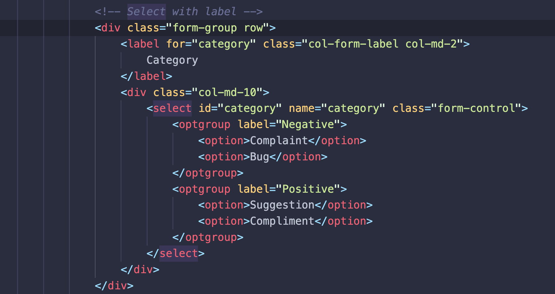
Instead of using an input element, use a select element in order to make the placeholder for user input one where the user chooses from options in a dropdown menu. Each option is surprisingly contained in an option element. Options can be grouped using the optgroup element labeled as desired. This can be accessed using the "Select with label" snippet.
Here's the code for it: