Centering an Image
To center an image on the page, use the classes 'd-block' and 'mx-auto'. Since the img element is inline,
it's necessary to make the image into a block element. mx-auto only works with block contents that
aren't at 100% width because it adjusts the left and right margins.
For centering a scalable image,
add the class 'img-fluid'. This will make the image stay centered but the height and width will respond
proportionally to the screen size instead of just staying obnoxiously large.
Resizing the Footer with Columns
When the screen is at least medium (786 pixels), the elements should be displayed in one row of four
columns. This is acomplished using col-md-3, in which each element recieves 3/12 of the availible space
within the row. You can see what this will look like in the screenshot below.

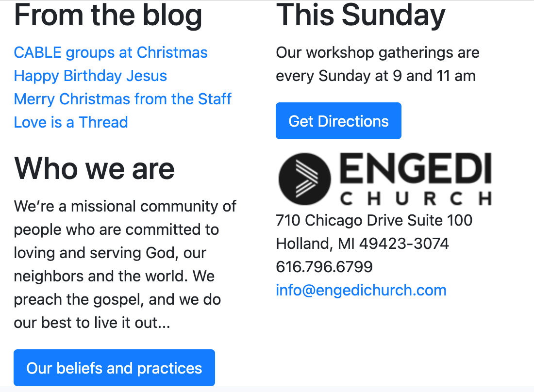
When the screen is small (greater than or equal to 576), the elements should be displayed in 2 rows of 2
columns. This is acomplished using col-sm-6, in which each element recieves half of the availible space
within the row. The screenshot below is an example.
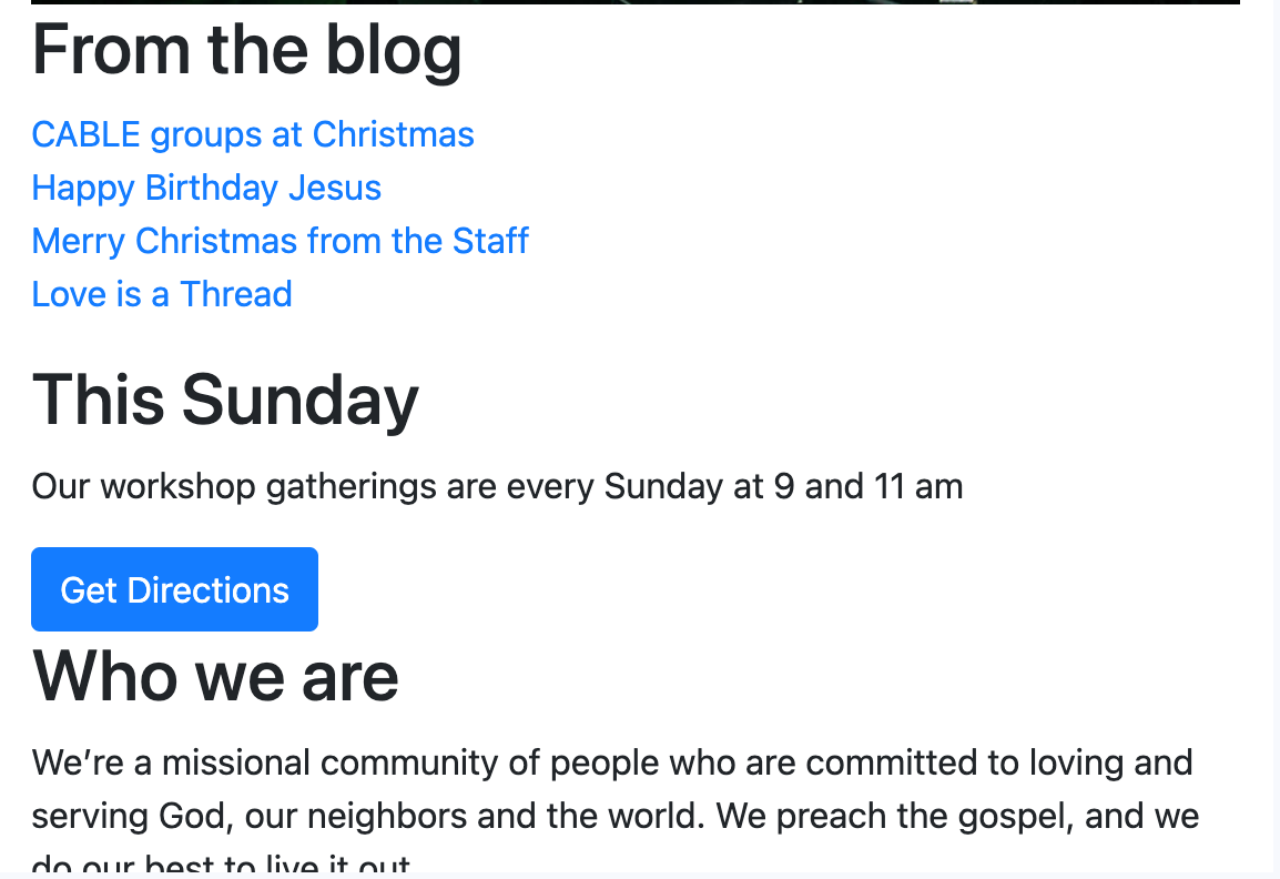
When the screen is sized to be extra small, which is less than 576 pixels, the elements should appear in
one column, which is achieved using col-12 since bootstrap doesn't include a size in class values for
the xs size. See the screenshot below.
Adding a Background Image
To add a background image, the rule will be as follows: background-image: url(add the url here).
background-repeat used with no-repeat will make it so the image on apears once. From here, the backgound
image can be moved around utilizing padding on different sides.
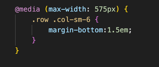
Hiding Content with CSS
In order to hide content under certain conditions, a @media query is needed. By specifying the max width,
you're able to decide at what size the contents will no longer be displayed.
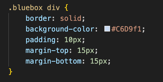
Formating the Flyer
An important note is to add the class of container to the body after pasting in the urls needed for
bootstrap, which will format it correctly with margins. The next step is to get all of the information
into the html formated badly so that it's all there and can be edited with CSS. Something helpful for
this was making sure the divs were formated in such a way that it could easily be changed in CSS for
that entire section. Below is the screenshot of the formating for the blue boxes. See this link for reference.