Lab 4

The CSS Border Property

Border: this property color, width, and style look around a certain property. For example I can use border-color and choose a color that will surround a certain attribute that I chosse. There is also border-width to control the distance surround the property. And lastly border-style like border-bottom of a text, if you put a dashed element then there will be a dashed lines under the elements.

The CSS Padding Property

Padding: it creates distance between the content and its border. For example the padding between each paragraph. Then the margin is the white space that is surround the element. For example, the margin will be the white space from the computer border to the text.

The CSS Font-Family Property

Font-family: When using the element font-family, there will be a list of fonts that you want to use, like arial. Then you typically end with a "generic" font. For example some generic fonts could be san serif, monospace, etc. The browser picks the font from left to right, seeing if the they have the font but will pick a like font if it can't.

The CSS Font-Size Property

Font-size: Font-size has many different types of things you could do with it. You can add a percentage to the font-size with a px (pixels) and this will make the font larger or smaller compared to the orginal font size. Or you can use the element em, 1 em is the current font size, annd then 2 em is double the font size and so forth.

Lab 5

To center and image with Bootstrap in CSS is to use the display flex box. This makes it so you can control where you want your selected attribute to go. Then when using the display flex content, you put the image in a row. After this you can center the image by using a justify-content and make it centered.

I added a grid class to make each div element have a smaller amount of space. Making the space each div have go from 3 columns to 2 columns.

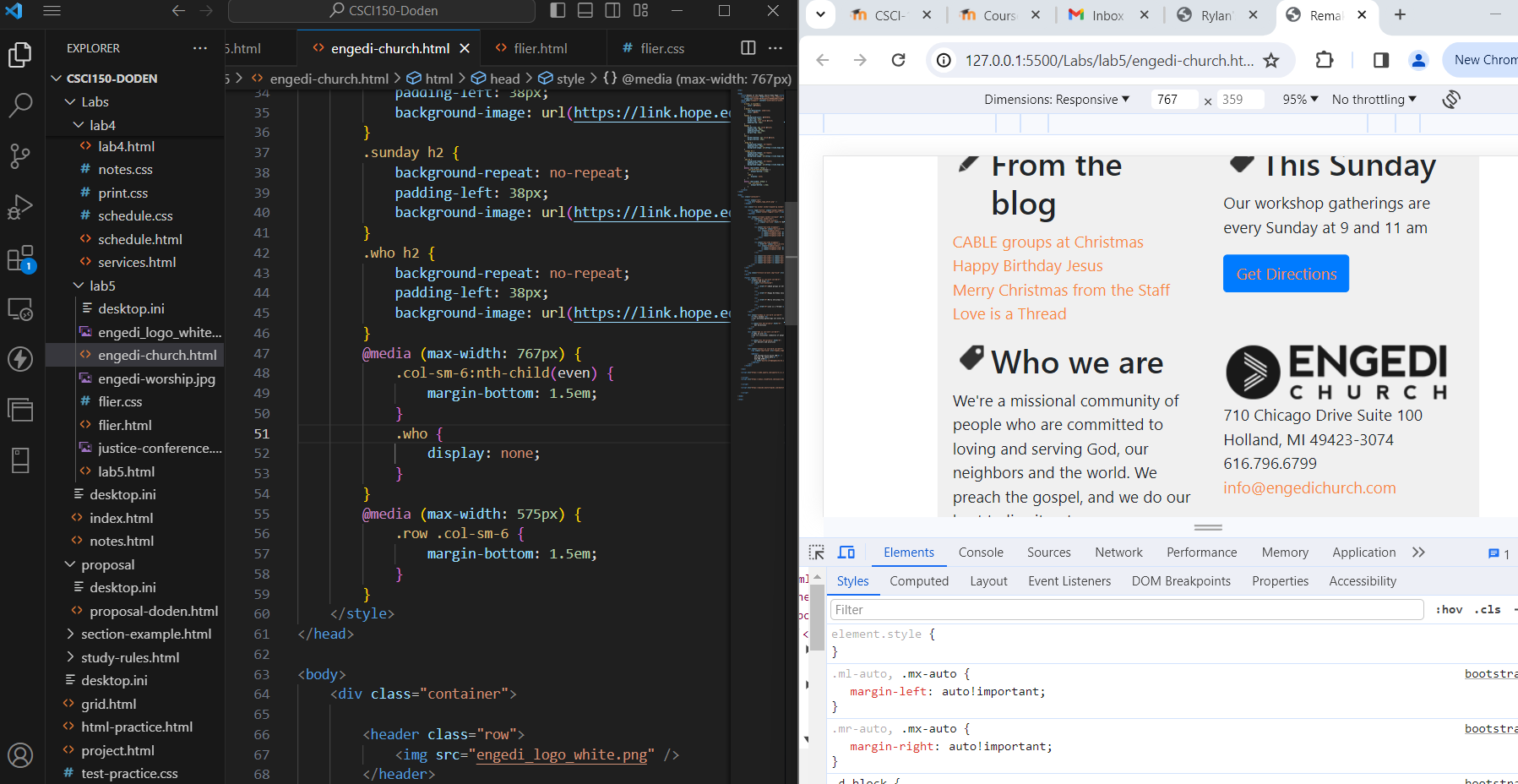
To add an backround image to an element you want to make sure you have the element selected. Then what you want to do is add a background-repeat attribute and give it the value of no-repeat, this makes it so that the backround image you choose only shows once instead of a group of images. Then the next things you want to do is add a backround-image attribute and give the url for the image. Then you want to had a padding-left so they backround image does not lap over the image.

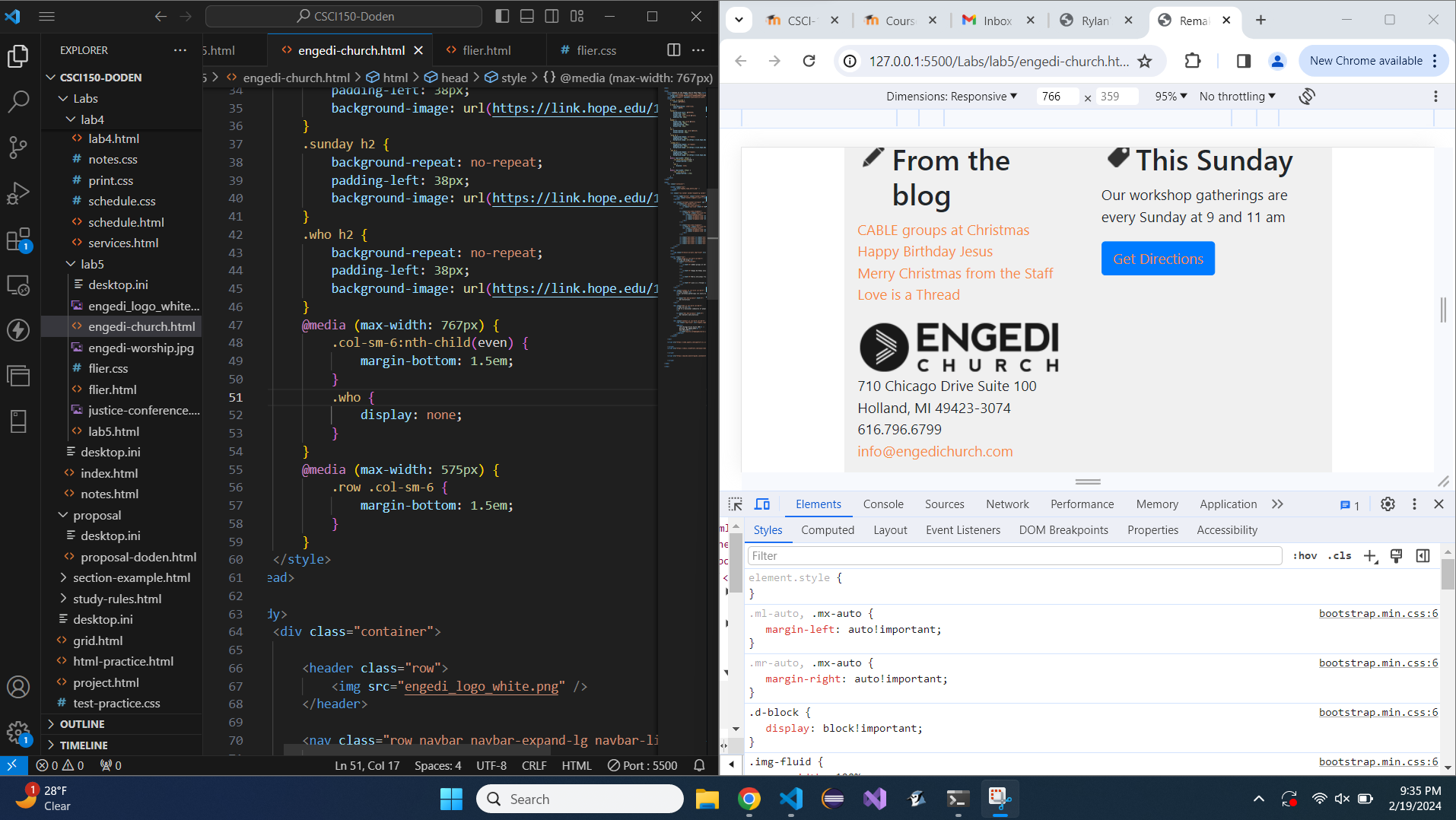
Bootstrap used the CSS display property to toggle the visibility of content at different screen sizes by adding a max-width query to the display property. So, selected elements can hide at certain sizes.

Firstly I created the html content that I needed for the document. Then after that I made an CSS file that was connected to the html file. This helped me to change some of the attributes to make it look how I wanted my html page to look.

Lab 6

Creating and using snippets

Snippets are attributes given to a clipboard to be used a re-usable code and cause shortcuts in the coding. This makes sure that when you are typing in your code it will be more efficient. Snippets save your time when coding and make it easier to code. The $ and # placeholder are the values of a certain portion of a selected attribute, and they are displayed when using an emmit abreviation.

                        
                    <section>
                        <h1></h1>
                    </section>


                     <article>
                          <h1></h1>
                    </article>


SCSS

In SCSS you can define a variable and apply the value to several properties, and change the value of the properties by changing the value of the definition. Resulting in the saving of time and effort when creating css.

                        
                            #OrderInfo td:nth-child(odd), #Addresses td:nth-child(odd) {
                                text-align: right;
                                padding-right: 10px;
                              }
                              #OrderInfo td:nth-child(odd)::after, #Addresses td:nth-child(odd)::after {
                                content: ":";
                              }
                              #OrderInfo td:nth-child(even), #Addresses td:nth-child(even) {
                                border: 1px solid #000;
                                padding-left: 10px;
                                text-align: left;
                              }


                            #OrderInfo, #Addresses {
                                td:nth-child(odd) {
                                text-align: right;
                                padding-right: 10px;
                                &::after {
                                  content: ":";
                                }
                                }
                              td:nth-child(even) {
                                border: 1px solid #000;
                                padding-left: 10px;
                                text-align: left;
                                }
                              }


Lab 7

Styling tabs

What I did to apply the "Hope Theme" to the tabs was to give the html an class, for example class .fall for fall courses. Then in the scss I gave the class attribute of fall a rule that would change the collar. For example, .fall {color: #036;}. That would give it the color I wanted, navy. Then do the same thing for the orange color.

Styling accordions

What I did to apply the "Hope Theme" to the accordion was in three main ways. Step one was the add an extra script to the html, in a, script src="https://webdesign.hope.edu/scripts/accordion.js" element. This made it so that the class accordion-heading-open is added automatically. Then the next step was giving html a class, class="card-header", and a data-heading="headingOne". These classes made the accordion be abled to be styled in scss. Then in scss I wrote down the classes, .card-header and .accordion-heading-open and added rules to them to make the display I wanted.

Lab 8 and 9

Steps of creating a navigational menu

The steps that I did to make the navigational menu consisted of many different steps. Firstly in the coding I was working on putting in a nav bar snippet. In this snippet all the nav content is contained within the nav elements with the corresponding classes. Then in those nav elements I put in regular nav items and drop-down menus as well. These elements will allow the user to navigate the website in an organized way. Then in these nav items and drop-down menus I can put links to different pages. Also when a person navigates the website they can change the size of the window and the website will change to fit that size well. For example, if the person shrinks the window they will see a hamburger menu instead of a cramped nav bar menu.

What I did to style the navigational menu

Most of the styling for the navigational menu I did in the scss. For this I gave the code of the navigational menu a div, class, and or id. This made me able to style or adjust the look of the navigational menu any way that I wanted to. I was able to control the navigational menu with commands for different colors, background-colors, image size, spacing, floating, font-family, and so much more.

How to use Google fonts on a page

For when you want to imput a font from Google fonts you have to go to fonts.google.com and then search for the font you desire to have. After you find the desired font then you select the style of font you want, for example, "Regular 400". Then after that you selct the option for an @import radio button option and copy that code without the tags. The paste the @import code back into your the top of your scss. Then add the name of the font to the place, class, or div that you desire the font to be in. For example, I can put the desired font in the body so the text in the body will be that font size. This is needed because scss or html might not have that font code or translation.

Lab 10

The input element

The input element creates a single-line input control that the user can control the type of information that they wish to select or put into the form and makes sure that the web can accept it. Then the description for the textarea element is a multi-line text input control, it is like a comment or feedback/review.

  • One value of an input element is an input for your first (last) name. it gives you a black (single) line to write your first (last) name. Ex: input type="text" id="lastname" name="lastname" class="form-control" placeholder="Enter last name", and the same elements but replace last name with first name.
  • Another value of an input element is an input for the way you wanted to be contacted. It gives you a radio of different selected inputs. For example, you can select telephone, text, or email. Ex: input class="form-check-input" id="contactTelephone" name="contactRequested" type="radio" value="Telephone". And you give this label of telephone. Do the same things but change of values to text and email.
  • Another one is writing your phone number. And the input gives you a format to follow. Ex: input type="tel" id="phonenumberInput" name="phonenumber" class="form-control" placeholder="Phone (format 999-999-9999)" pattern="/d/d/d-/d/d/d-/d/d/d/d".
  • In the feedback html there is an input element to put in your comment. Ex: input class="form-control" id="comment" name="comment" placeholder="Enter Enter your comment" required="" rows="5".
  • In the feedback there is also another radio input for if you wanted to be contacted or not. Ex: input class="form-check-input" id="contactYes" name="contactRequested" type="radio" value="Yes". And then add the same values for no.
  • The select element

    In the select element that was made you add an option elemnt and you give those option elements values for your customers to choose from. Then you can add a tag of optgroup to give certain elements that have the same characteristics a label, like positive tags/values and negative tags/values. Ex: select class="form-control" id="categoryInput" name="category" optgroup label="Negative" option Complaint option option Bug option optgroup option Suggestion option optgroup label="Positive" option Compliment option optgroup select