Recommendations
Recommendation 1
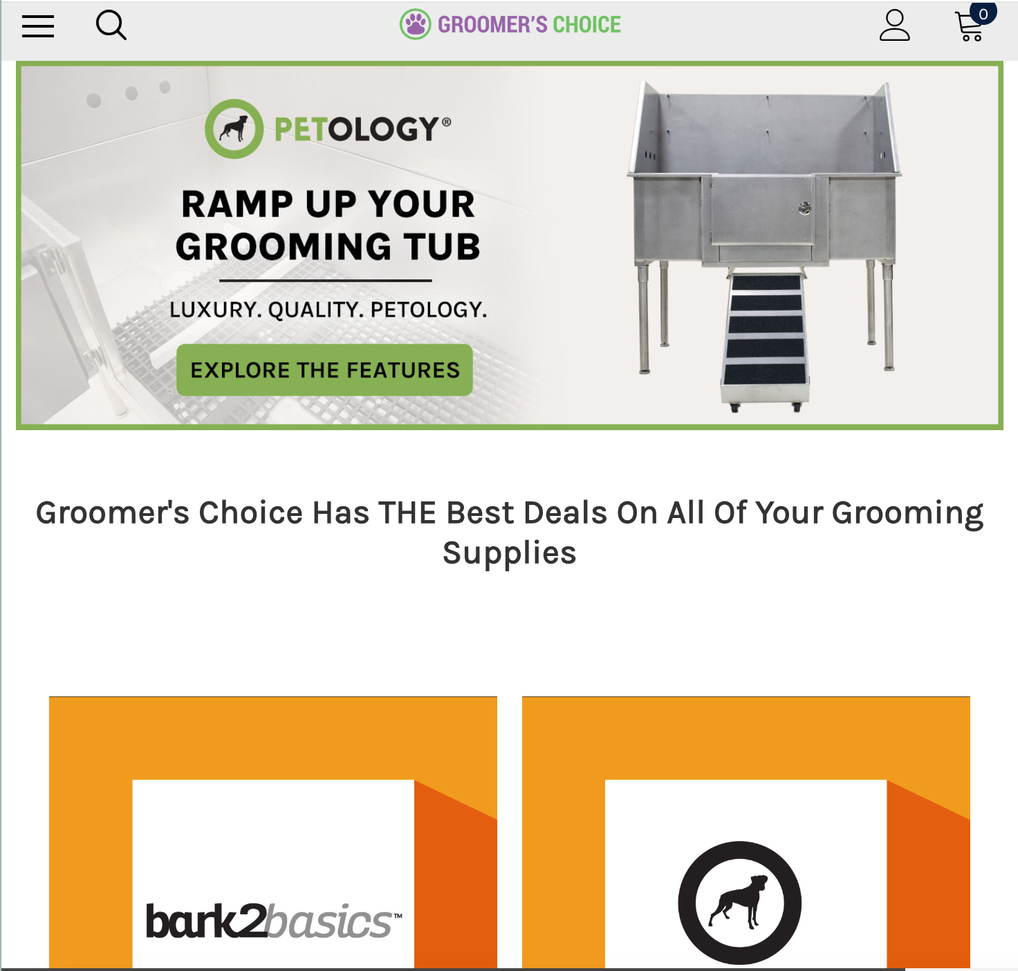
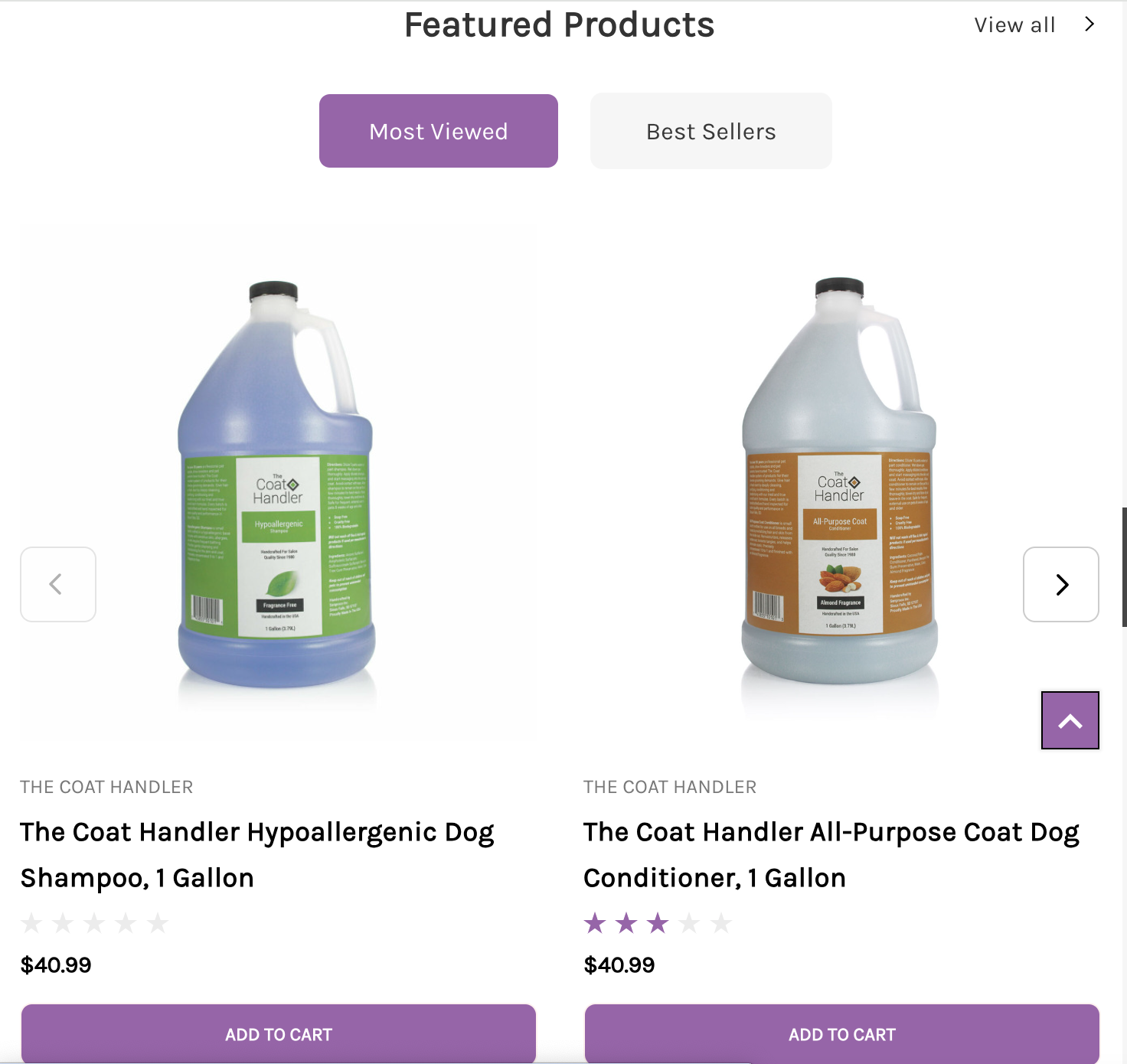
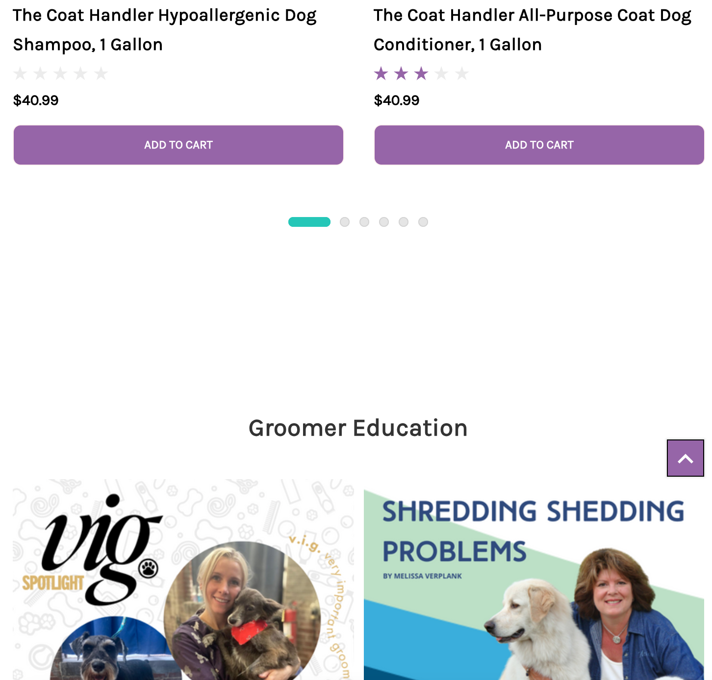
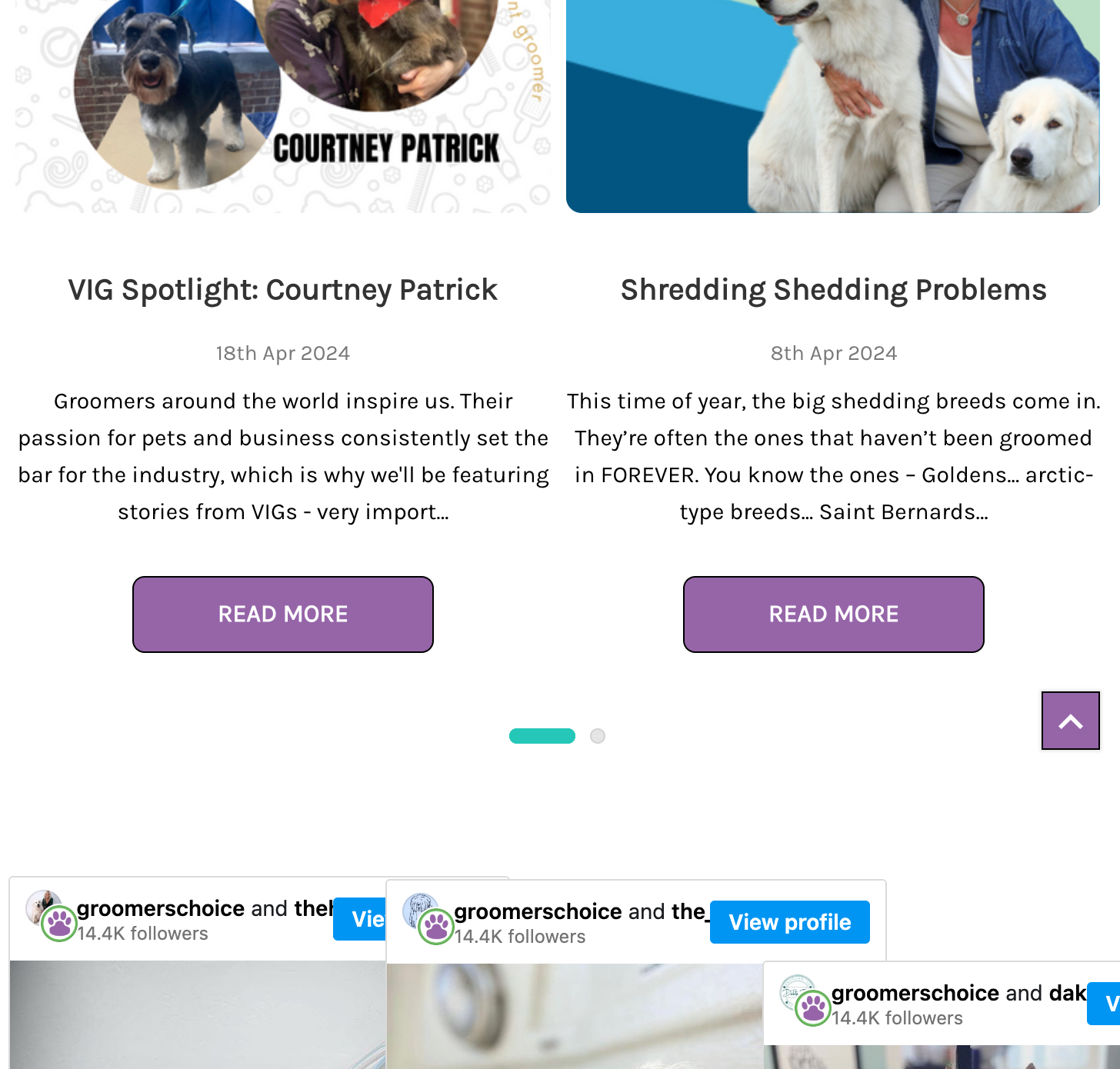
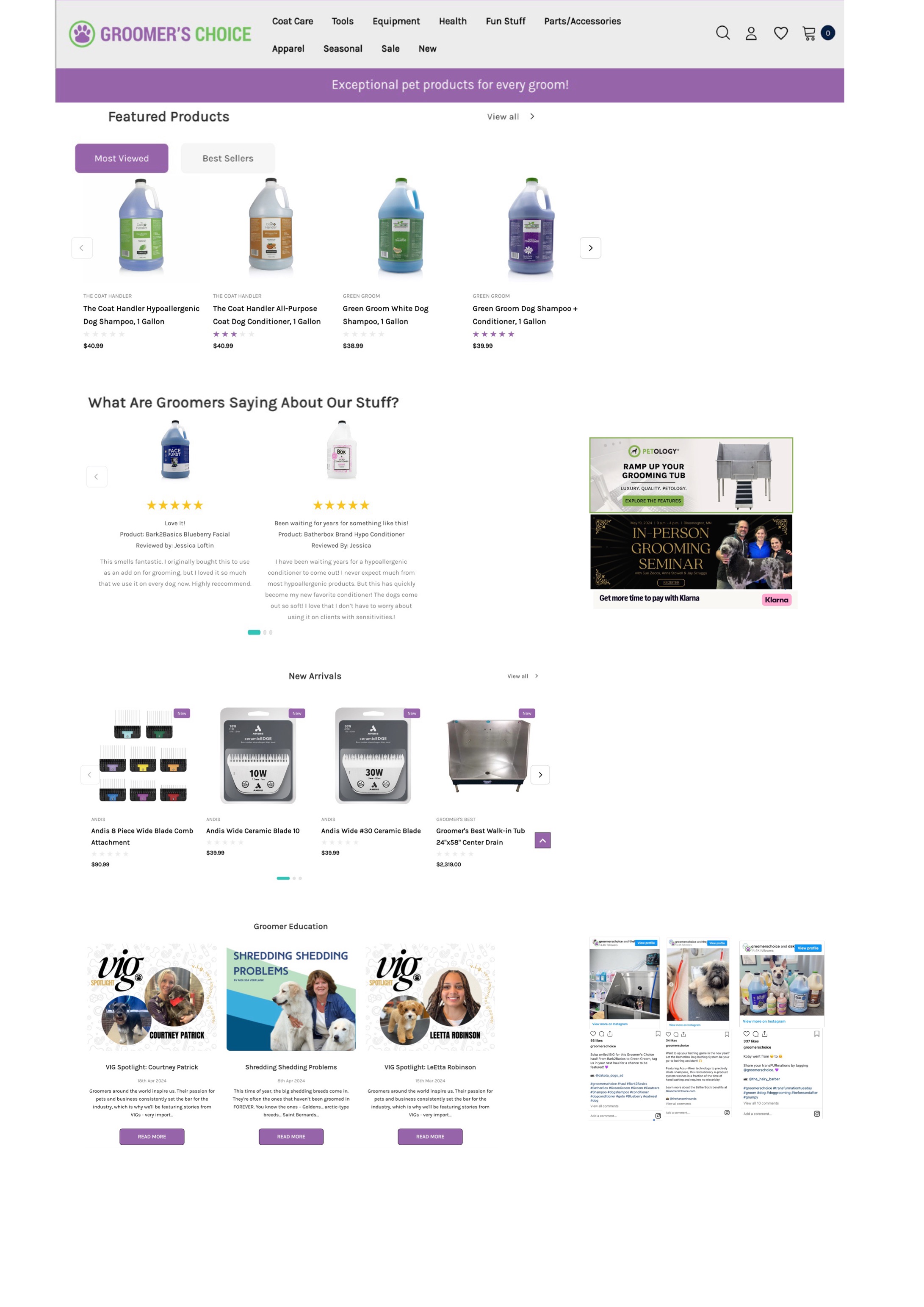
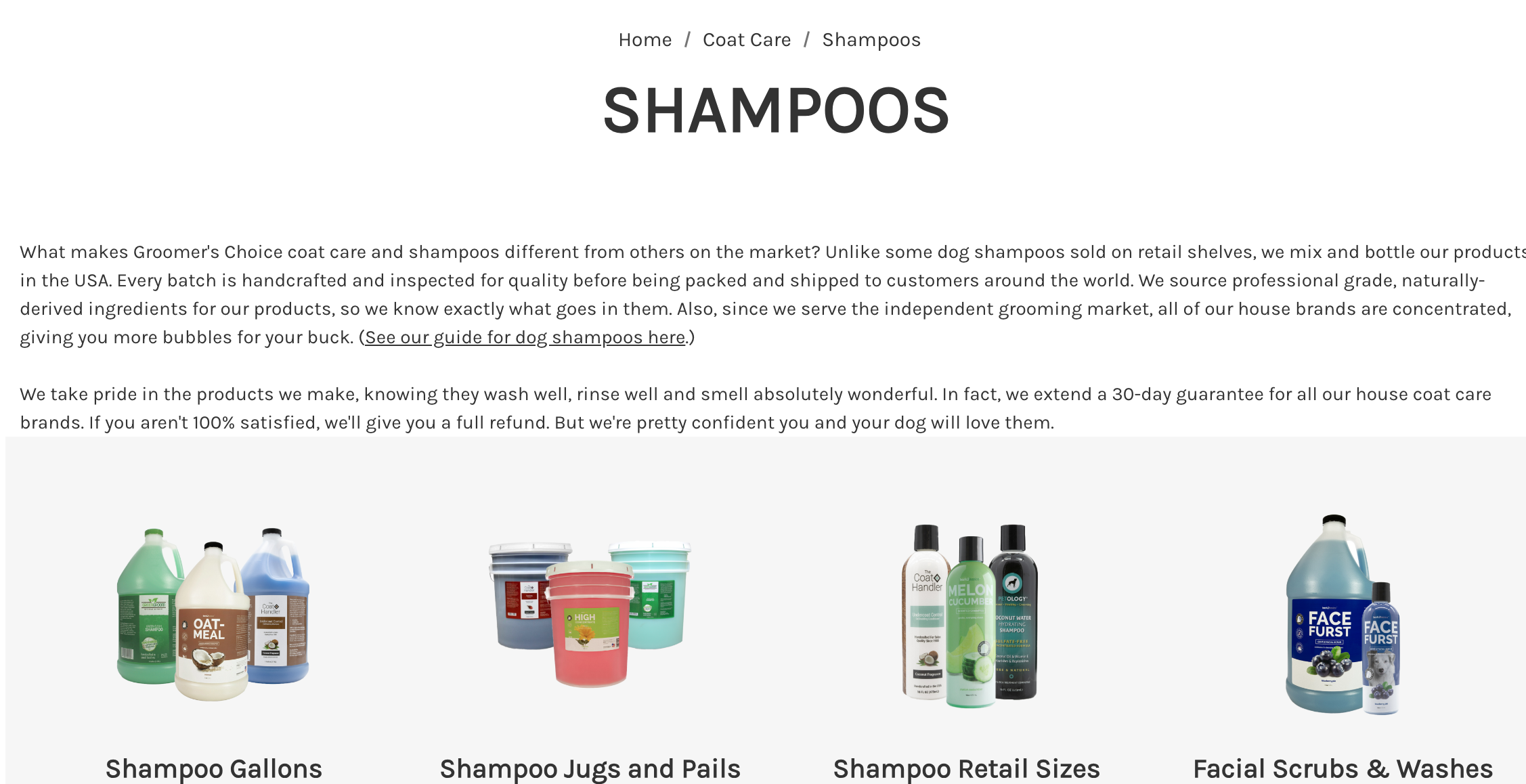
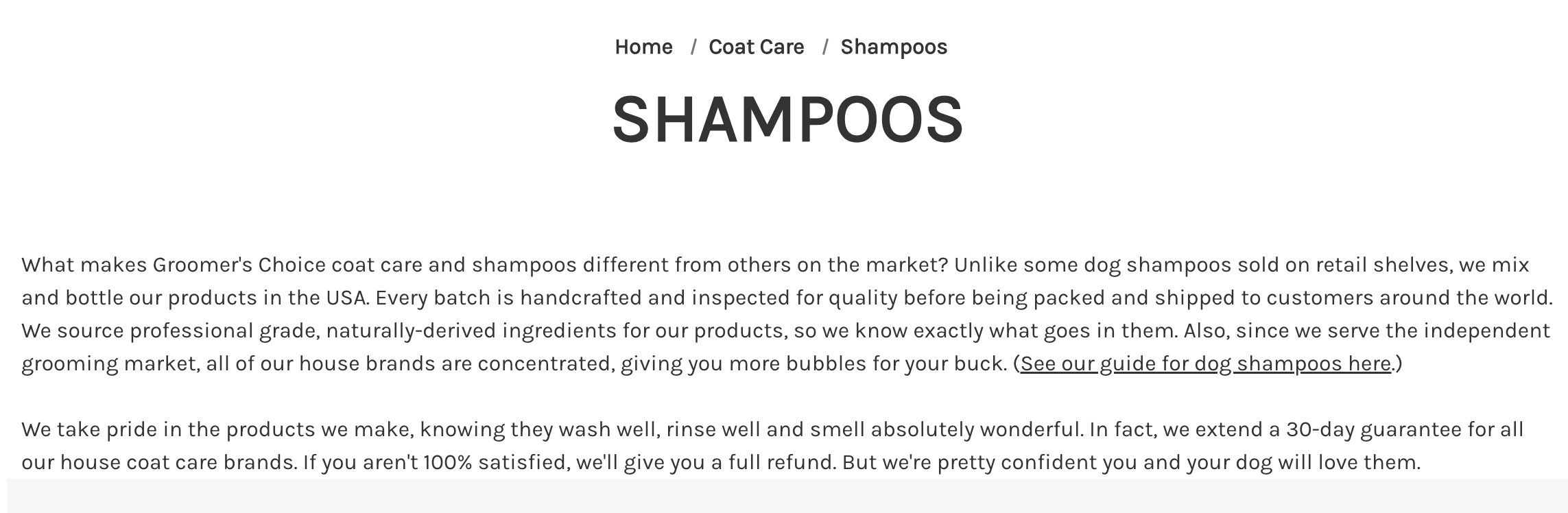
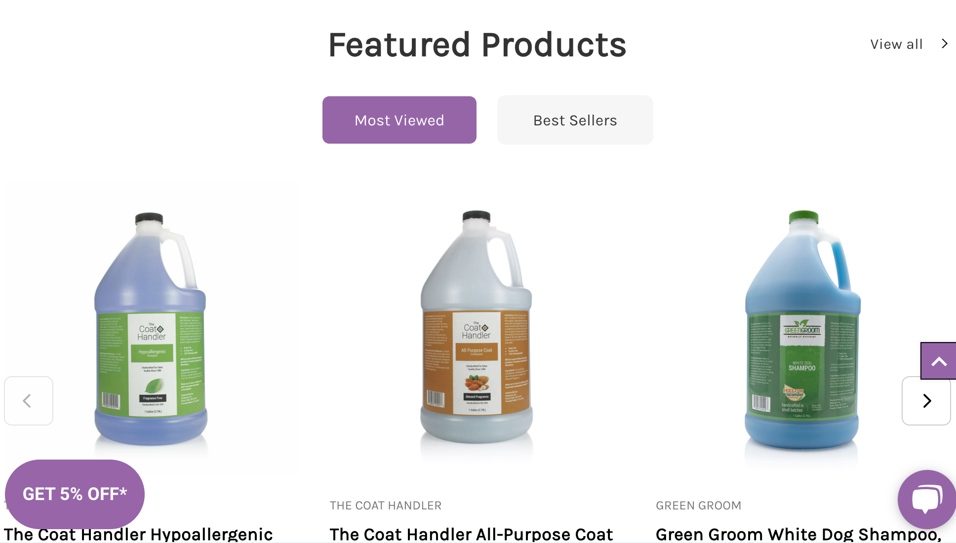
The homepage could benefit from some reorganization and creativity in the layout. A homepage consisting of only horizontal elements creates unnecessary length and increases the number of false bottoms. For example, I had to take 9 screenshots to capture all of the content on the homepage. The organization of the page does not seem to be in an order that fully takes into account the needs of the users. I would recommend shifting some elements to the side of the page and reducing their size, particularly the ads or announcements. This would allow for the other elements that pertain to most users' goals to be highlighted and more easily discernable.
Possible fix
Recommendation 2
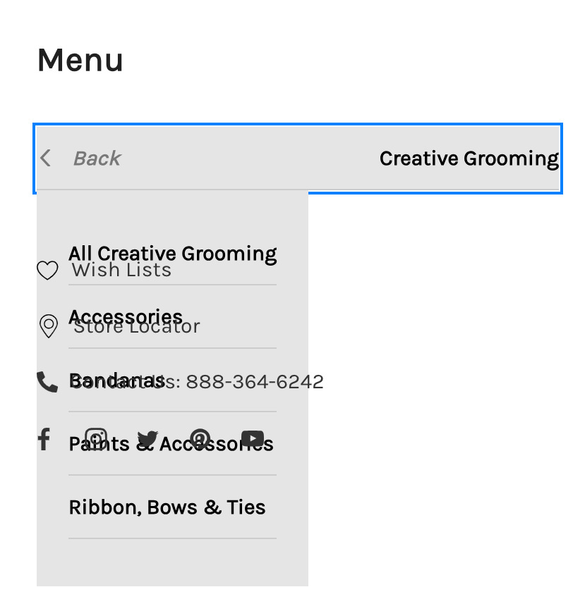
The most pressing issue with the site is the overlapping navigational menus at medium screen width. This hinders the navigability and responsiveness of the site. I would recommend taking a look at the media queries at each screen size to determine what is causing the two menus to overlap only at medium width.
Recommendation 3
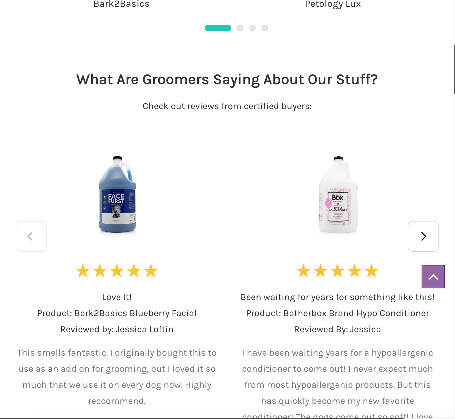
The typography across the board could be adjusted so that paragraph text, such as product details, blog posts, reviews, etc are easier to read. A lot of text is in light gray, some of it is dark gray, but when using a color other than black, the font-size should be taken into account in terms of readability by most users.
Possible Fix
Recommendation 4
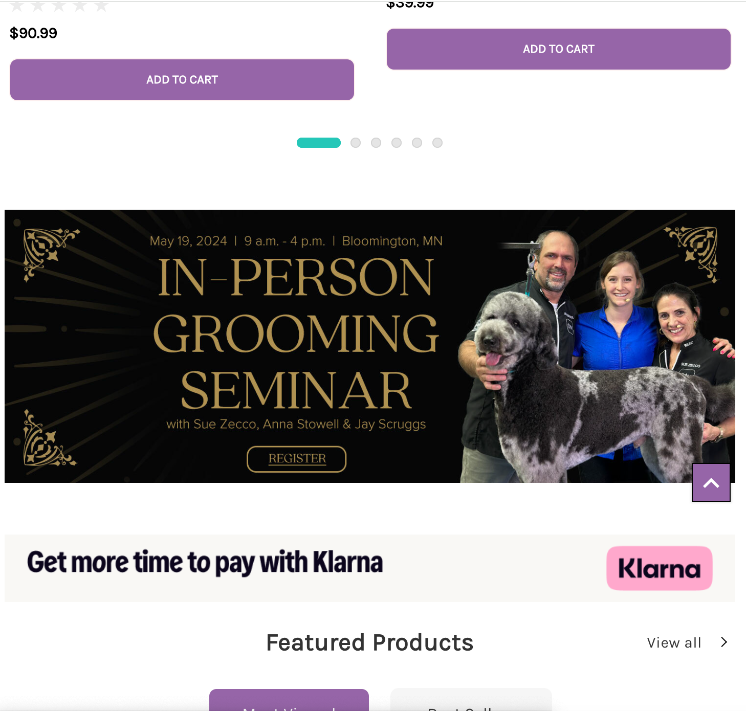
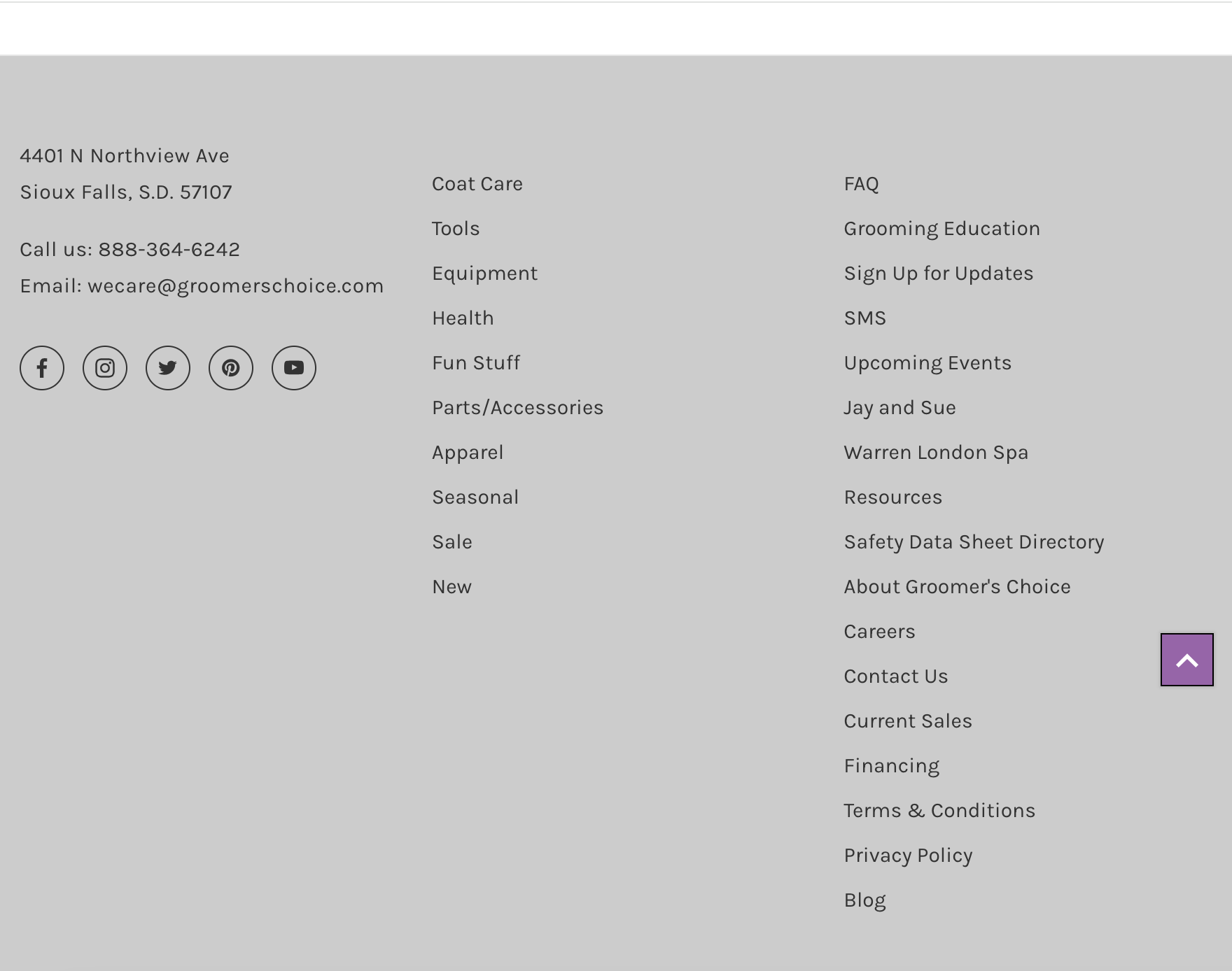
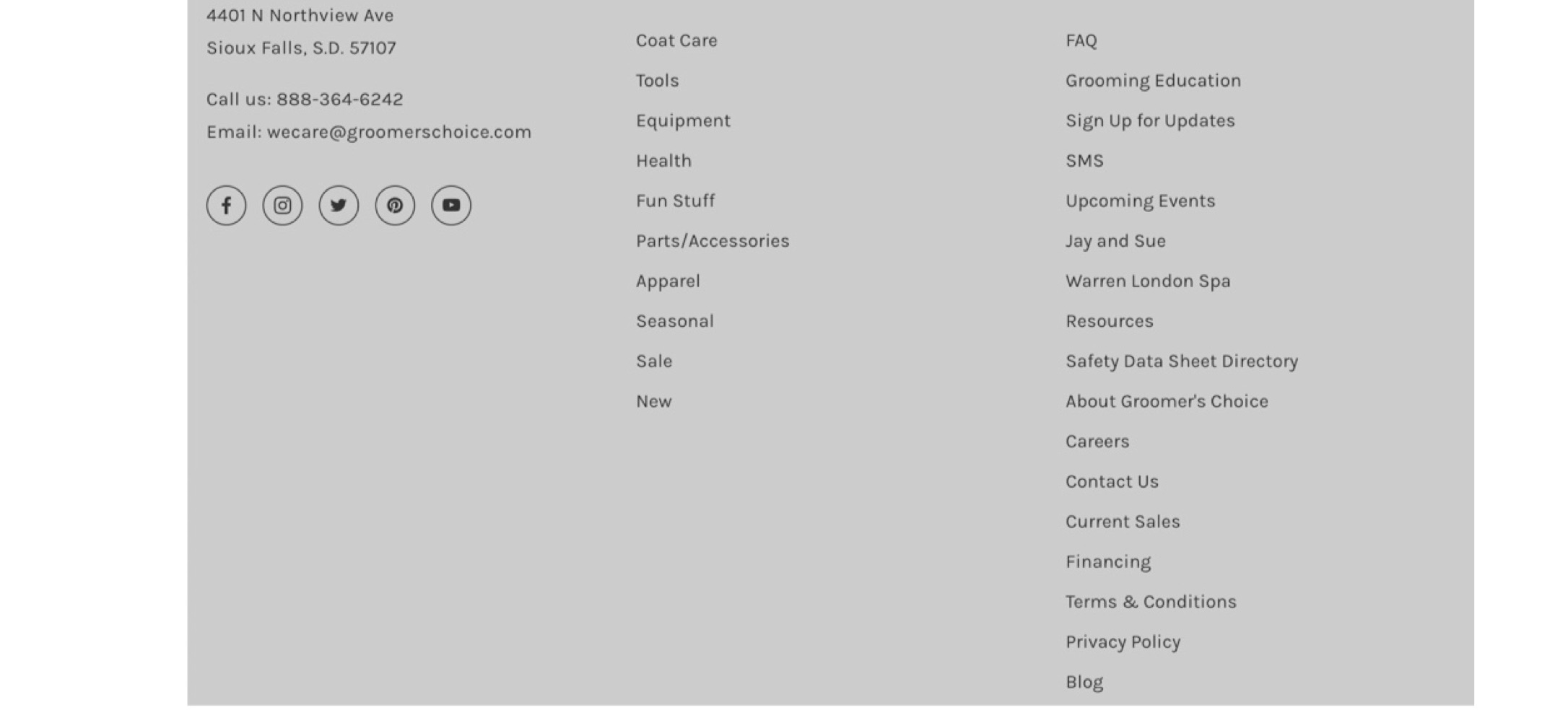
I would also recommend minimizing the use of light text on a somewhat dark background. Because it is not that frequent, it would help to just darken the background color so that the text stands out more and make the text bolder and larger. Another solution could be to lighten the background color and go with a black font, but I think that the purple or green behind the white makes some text or buttons stand out and is consistent with the overall feel of the site and its integration of brand colors.
Possible fix