Strengths
Groomer's Choice does a very good job of integrating its brand colors throughout the site, and the site as a whole is very visually pleasing.
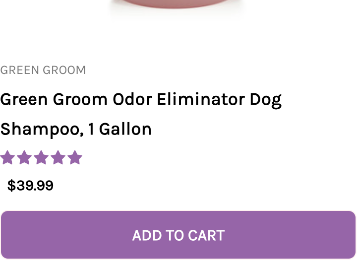
The colors they use are green and purple. All buttons, like the "Add to Cart" or "Show more" buttons, have a purple or green background color, respectively. The stars for the reviews are also purple, which I think is a really nice detail. The use of the colors is also not too overwhelming to where the pages look busy, but there is just enough to make the elements that do have those colors stand out and lend themselves to the aesthetics of the site.
It also does a wonderful job at appealing to the wide variety of skill levels, expertise, and interests of its visitors and creating conversations with each group.
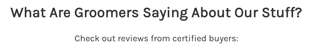
There are pages for blog posts, an FAQ, groomer's education resources, upcoming events in the dog grooming world, the option for setting up updates and messages, and a button that allows the user to speak with a representative if they have a question while browsing. Many of the headings and the product details show a knowledge of what their users would want to know and what they would be most interested in seeing when they visit the site, such as deals, most popular products, or what professionals are saying about their products, and the specifics of the products they are interested in.
Weaknesses
The area that could use the most is the homepage, particularly in its organization and layout.
Images and carousels are very large and span the entire width of the page. It takes a very long time to scroll to the bottom, and it seems almost counterintuitive to have such large images with such small text underneath.
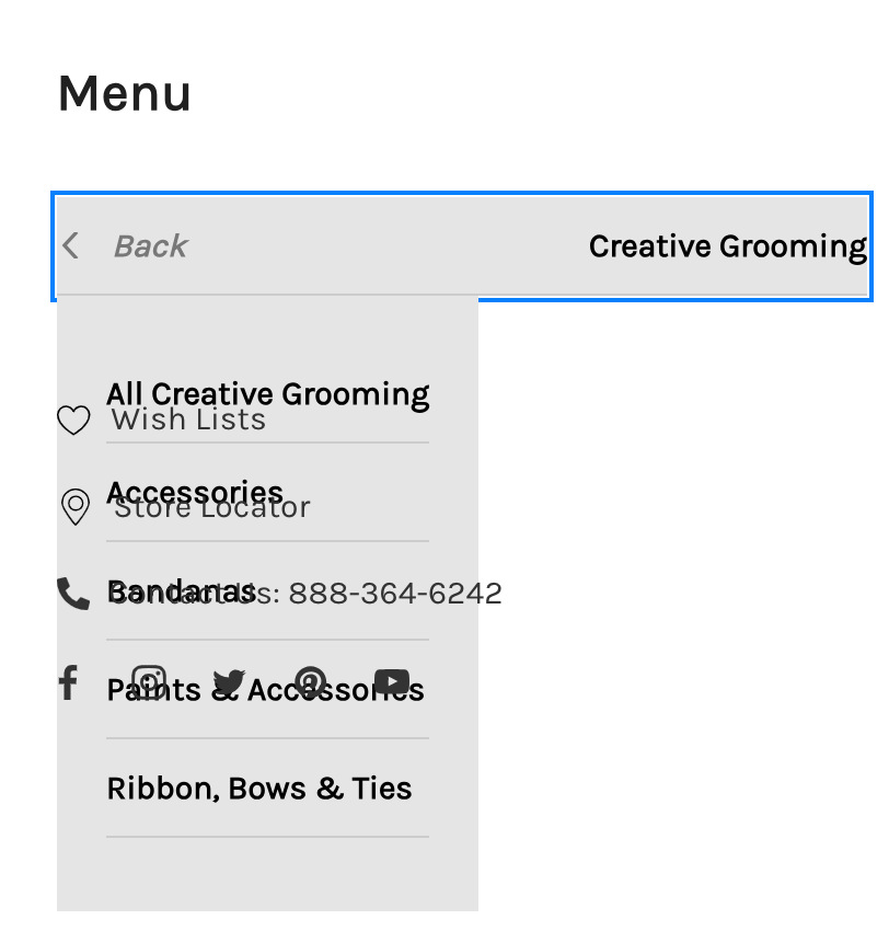
Navigation menus do also need some work, but this is mostly in relation to its responsiveness at various viewport widths.
The navigation menu collapses at screen sizes smaller than large. At medium width, some of the navigation lists overlap one another, with one list almost completely obscuring the access to items in the list behind it. The menu items themselves could also be organized differently, with the most useful being placed at the top, like the new products or sale buttons.
Headings are another area that could use some work, both in typography and contrast with background colors.
The font in front of colored backgrounds is white and has a very fine width, further hindering the readability. Some headings could also benefit from an increase in font size or maybe some text decoration or a border to highlight the fact that they are headings. Many of those headings have too much space between them and the items they're referencing.


There are some issues with design that prevent easy use.
On some longer product pages, the button for loading more products tends to stop working after the second or third time reaching the bottom and just seems to be stuck on the loading icon.